We desperately need to find a way to get more customer feedback and suggestions for product improvement, but what is the best way to do that?

Surveys rarely have a high response rate, but we need to gather customer feedback. Therefore, we created this blog posting as a living document of how we are trying to gather customer feedback. Specifically, we are looking for more customer feedback and better engagement with us. We don’t just want YouTube subscribers to like our videos, we want you to share our videos with other people in your company so they can learn about quality and regulatory too. We don’t just want you to register for a free webinar and watch the recording when you get a chance. We want to you to add a question when you register and please interrupt us during our live webinars to clarify anything you don’t understand. Finally, we want you to give us suggestions for improving our procedures, writing new blogs, and recording new training webinars and videos. Tell us what you want.
Using the headline analyzer to attract more customer feedback
We have a page on our website for a “suggestion portal” where we are asking people to provide suggestions for new and improved procedures, blogs, webinars, and videos. But the last time someone filled in the form on that page is October 16, 2019. We desperately need to find a way to get more engagement from you in the form of suggestions. The first approach to gathering feedback is to send out email notification to our current 1,057 blog subscribers by posting this blog. To improve our chances for you to open an email about this blog, we optimized the headline using the CoSchedule Headline Analyzer. The first version of the headline scored a 75, while 70 is the minimum threshold for a worthy title. Our second attempt included the emotional word “exciting” and the new result scored an 83 (see below). Normally it requires 20+ tries before we achieve a headline score higher than 80, but today was a good day. We decided to stop at 83 and focus on other elements of this posting.
- How can you encourage more customer feedback? (75)
- How can you encourage more customer feedback and exciting engagement? (83)
A picture says 1,000 words
A great thumbnail or featured picture often helps improve click through rates for video, but pictures also communicate more information than words alone. Pictures can communicate the temperature, directions, speed you are moving, and even emotions. Ideally, a combination of a picture with a short caption does the most. The layout of your picture matters too. For example, the featured image above originally had just 6 images grouped together. To communicate that we were trying to decide which icon best communicated the concept of a suggestion box, we separated each icon image with a blue border. To help people identify the different images, we used letters under each icon image. We could have used numbers, but then people might have replied with phrases like “#2 was my 1st choice,” instead of “B was my 1st choice.” To make it clear that the far right icon image was our current icon, we used the word “current” instead of a letter. Finally, we used a bright yello text box at the top of the featured image to communicate instructions for polling of the various icon images.
In the end, we didn’t feel that the suggestion box icons were very attractive. In fact, icons in general are boring. Therefore, we hired an artist to create some concept sketches for other ideas that would communicate “please take the opportunity to give us your suggestion.” The three concepts we liked most were a wishing well, a coffee filter, and an open door with a suggestion doormat that opens into space. We selected the door as our favorite and added some details to create the final image you see now on our webpage. Specifically, we wanted the doormat to appear more three-dimensional, we wanted to incorporate Medical Device Academy’s logo, and we wanted a better focal point in the space beyond the door. Therefore, the artist created three different versions of a moon (crescent, partial, and full). The partial moon was our final choice.
A video is 1,000+ pictures
Full-frame video typically ranges from 24-60 frames per second (FPS). Therefore, there are at least 1,000 pictures in 42 seconds of video. Therefore, the five-and-half-minute video below is giving you much more information than you read above in a lot less time. The video walks you through the evolution of our suggestion box (all 24 versions). This is why we recommend recording a training video to every single medical device company we work with. This is also why our website has steadily been increasing the number of videos we procedure and publish on our YouTube channel.
A call to action increases customer feedback and engagement
Gathering customer feedback requires just as much marketing as selling a medical device. Typically, near the end of your presentation you will include a call to action. The call to action is intended to persuade customers to take immediate action. The call to action will create a sense of urgency. Sometimes a series of small calls to action will precede a final larger call to action. In our case, we are just trying to get suggestions from you regarding what quality and regulatory training materials we should develop next. We are asking you for advice on what our customers want to learn. In return we will develop the training materials you want. The better your questions are, the better our training materials will become. This strategy of offering valuable information to customers develops trust, and this has been our company’s primary marketing strategy since the beginning.

Try using a call-to-action button
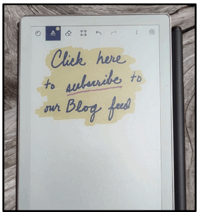
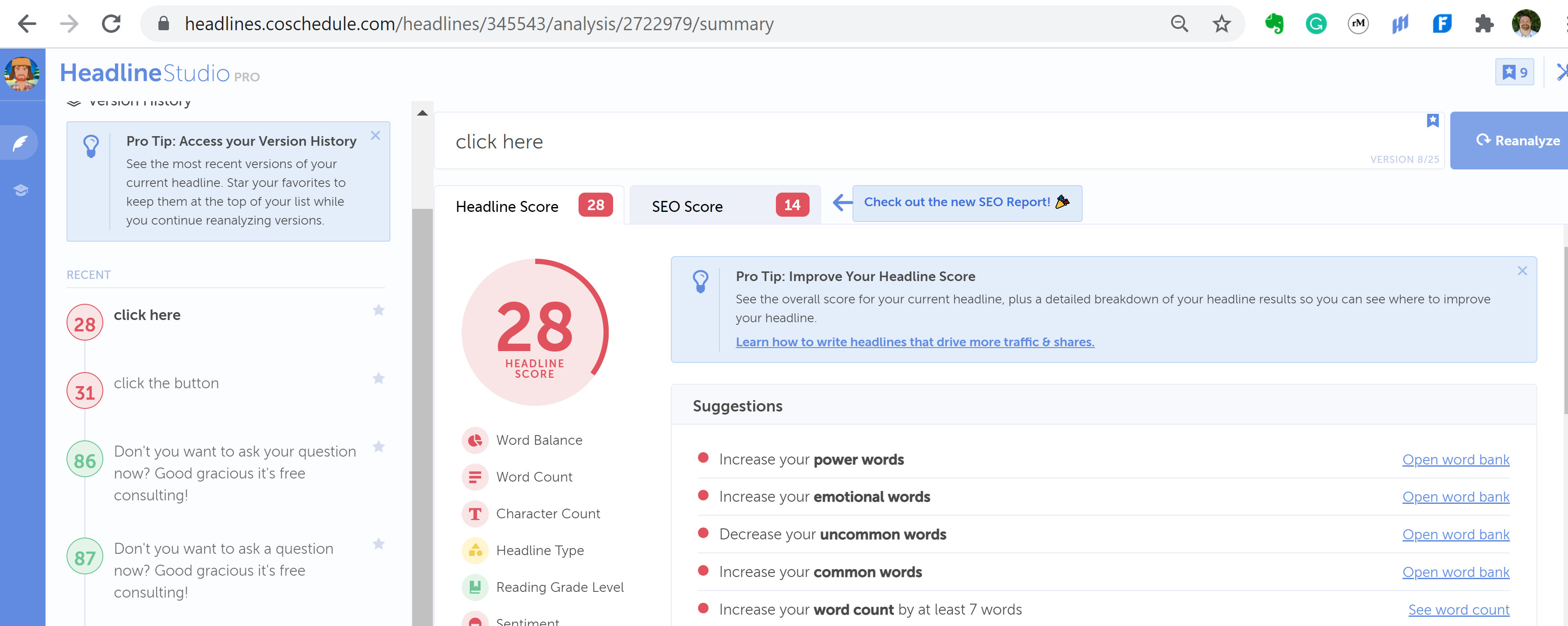
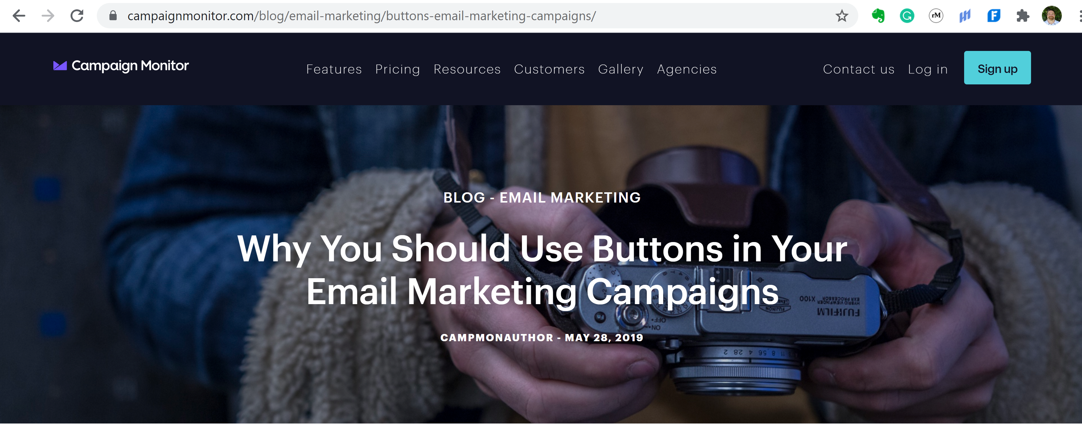
If you want more engagement, you need to increase your click-through rate (CTR) first. Campaign Monitor conducted a test to which call-to-action performs best. They found a call-to-action button helped increase the CTR by 28%. We took this concept one step further, we used the headline analyzer tool to optimize the wording of the call-to-action button. The wording we used in the call-to-action button above scored an 86, while “click here” scored a dismal 28 and “click the button” only scored 31. We are also trying a contrarion approach to the design of the button. Instead of using bright colors that modern advertisers have trained us to ignore, we used a light grey background with Palatino Linotype font to optimize readability. We also used a small caption to make sure your subconscious knows what to do.


